Choosing the first color can sometimes be harder than coloring the page itself.
A large box of pencils may contain dozens of beautiful options, but looking at all of them at once can make it difficult to decide where to begin.
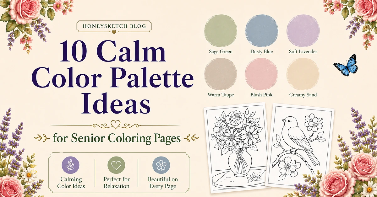
A small color palette solves that problem.
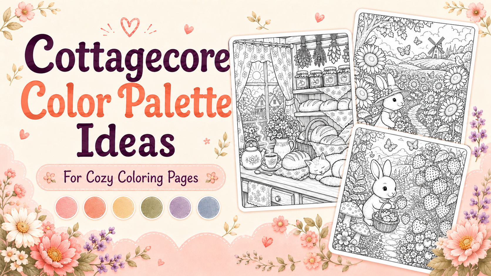
Instead of choosing a new shade for every flower, feather, or object, select four to six colors and repeat them throughout the picture.
This creates a coordinated page while keeping the coloring process simple.
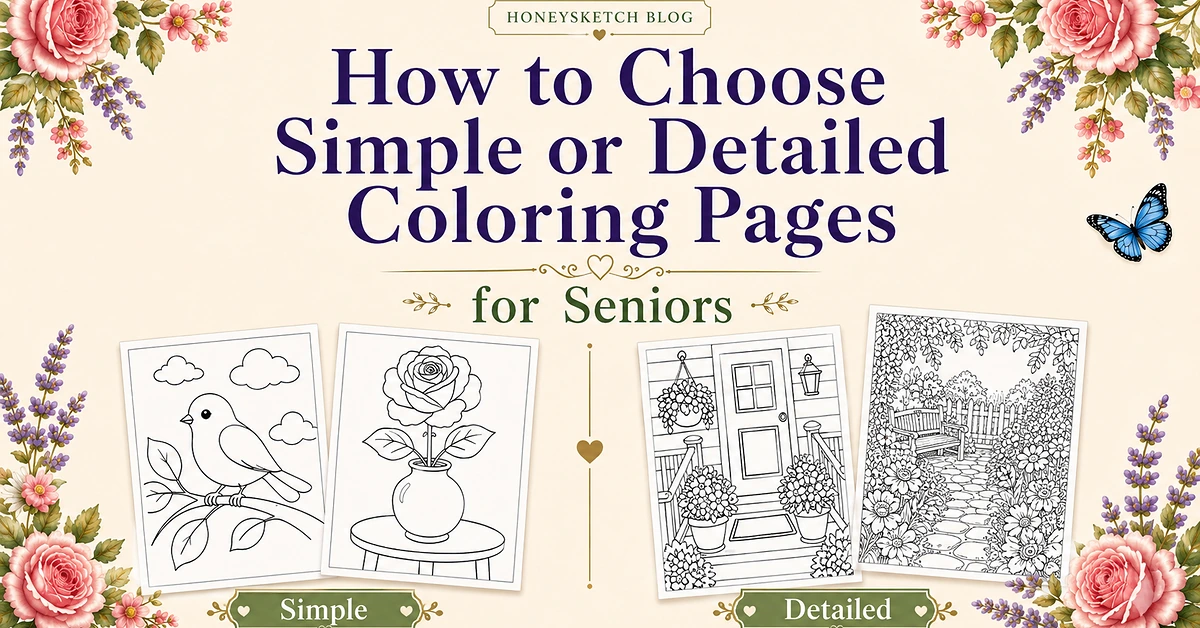
The preview pages in this article come from the HoneySketch Large Print Coloring Book for Seniors.
The preview pages in this article come from the HoneySketch Large Print Coloring Book for Seniors.
How to use a limited color palette
Choose five colors before beginning.
Place those colors beside the page and move the rest of the supplies away temporarily.
Use the five shades for:
- main subjects
- flowers
- leaves
- backgrounds
- small details
Brown, gray, black, or cream can be added as neutral colors when needed.
The suggested palettes below are starting points, not rules. Any shade can be replaced with another favorite color.
1. Soft rose garden palette

Use:
- blush pink
- dusty rose
- sage green
- warm cream
- pale blue
This palette works well for:
- roses
- flower vases
- garden benches
- porches
- floral baskets
Color the rose with blush pink and dusty rose. Use sage for the leaves, pale blue for the vase, and cream for the table.
2. Classic flower palette
Use:
- red
- yellow
- forest green
- light blue
- warm brown
This familiar combination works well for simple flowers and outdoor scenes.
Use red or yellow for petals, green for leaves, blue for the sky or vase, and brown for furniture, baskets, or paths.
3. Cheerful butterfly palette
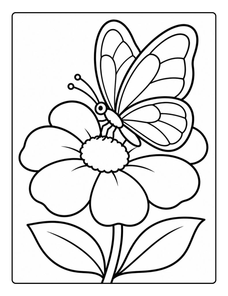
Use:
- turquoise
- purple
- pink
- yellow
- leaf green
Alternate turquoise and purple across the butterfly wings.
Use pink or yellow for the flower and green for the leaves.
Another option is to color both sides of the butterfly symmetrically. Whatever color appears on the left wing can be repeated in the same area on the right wing.
The complete HoneySketch paperback includes 50 single-sided pages with flowers, animals, gardens, porches, pets, birds, and familiar everyday scenes.
4. Lavender garden palette
Use:
- lavender
- deep purple
- sage green
- pale gray
- cream
This combination suits:
- butterflies
- flower gardens
- porch scenes
- flowerpots
- bicycles with baskets
Use lavender for the largest flowers and deep purple for smaller details. Sage provides a soft leaf color, while gray and cream work well for backgrounds.
5. Peaceful spring meadow palette
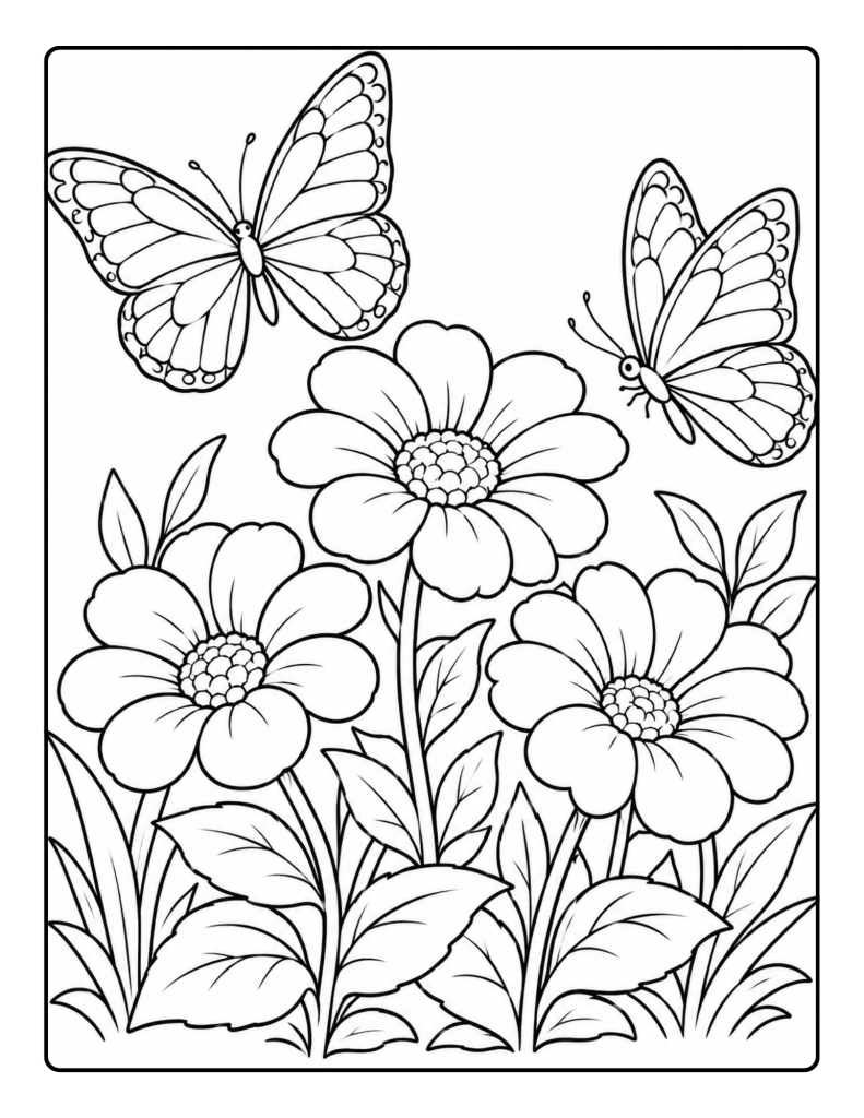
Use:
- light pink
- daffodil yellow
- sky blue
- fresh green
- lilac
Give each large flower a different main color.
Repeat the colors in the butterflies so the entire page feels connected.
For example:
- first flower: pink
- second flower: yellow
- third flower: lilac
- butterflies: blue, pink, and yellow
- leaves: green
You may also like: “Cute Rabbit and Fox Coloring Pages“
6. Bright summer palette
Use:
- coral
- orange
- sunflower yellow
- turquoise
- emerald green
This palette works well for lively gardens, picnic scenes, butterflies, and flower carts.
Use coral and orange for the largest flowers, yellow for smaller flowers, turquoise for containers or backgrounds, and emerald for leaves.
Find More Pages to Color
7. Cool pond palette
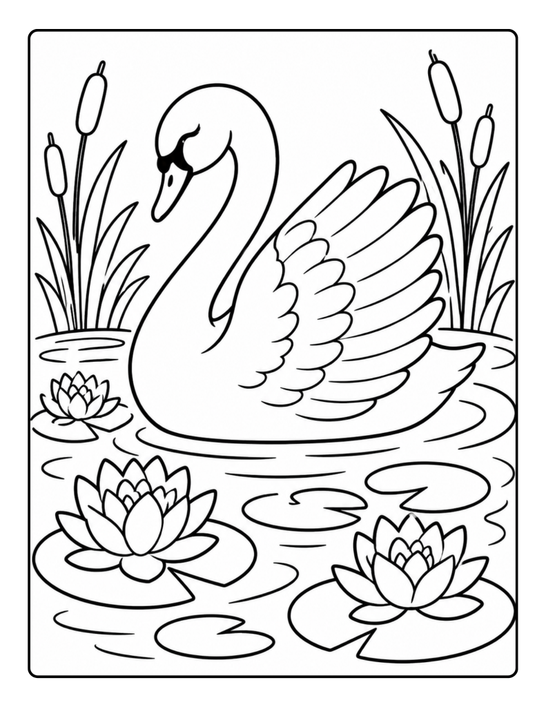
Use:
- soft blue
- deep blue
- aqua
- leaf green
- lavender
This group works well for:
- swans
- koi ponds
- water lilies
- birdbaths
- outdoor water scenes
Use soft blue and aqua for the water. Add deep blue around ripples or edges.
Color lily pads green and flowers lavender.
A white swan can remain mostly uncolored with small touches of pale blue or gray near the wing lines.
8. Warm country palette
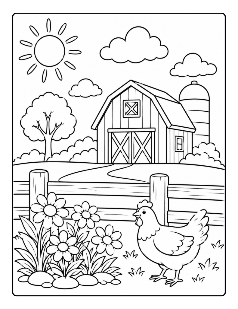
Use:
- barn red
- golden yellow
- warm brown
- grass green
- sky blue
Use barn red for the building, golden yellow for flowers or the chicken, brown for fences and paths, green for grass, and blue for the sky.
This palette also works well for:
- horses
- picnic baskets
- wooden carts
- country fences
- autumn porch scenes
9. Gentle autumn palette
Use:
- burnt orange
- golden yellow
- burgundy
- olive green
- warm brown
This palette can turn almost any outdoor scene into autumn.
Try it on:
- park bench pages
- porches
- garden paths
- flower carts
- bicycles
- farms
Leaves do not all need the same color. Alternate orange, yellow, burgundy, and olive.
10. Cozy cottage palette
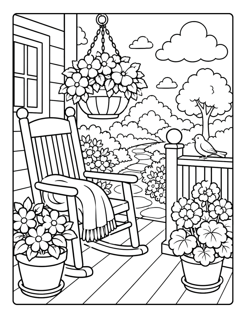
Use:
- dusty rose
- lavender
- sage green
- warm cream
- muted blue
This is a versatile combination for peaceful home and garden pages.
Use dusty rose and lavender for flowers, sage for leaves and furniture, cream for walls or flowerpots, and muted blue for blankets, doors, or sky.
Use different shades of the same color
A palette does not always need five completely different colors.
Try a mostly blue page using:
- pale blue
- sky blue
- medium blue
- navy
- blue-green
This is called a monochromatic approach.
It works especially well for:
- butterflies
- flowers
- cushions
- vases
- decorative doors
The finished page can look coordinated even when only one color family is used.
Create a three-color page
For the simplest approach, choose only three colors.
Examples include:
Pink, green, and blue
Good for flowers, leaves, vases, and sky.
Yellow, purple, and green
Good for butterflies and gardens.
Red, blue, and cream
Good for farmhouses, porches, and picnic scenes.
Orange, brown, and green
Good for autumn paths, horses, and outdoor scenes.
Lavender, pink, and sage
Good for soft floral pages.
Neutral shades can be added when needed.
Repeat colors across the page
Repeating colors makes a detailed picture easier to plan.
For a garden:
- use one pink for all roses
- use one yellow for all daisies
- use one or two greens for every leaf
- use one brown for wooden objects
- use one blue for sky and water
This prevents the colorist from needing to select a new shade for every object.
Realistic colors are optional
A rose can be blue.
A butterfly can be green and pink.
A swan can be lavender.
A horse can be pale yellow.
The palette should reflect the colors the person wants to use, not what the object is expected to look like.
How to choose a palette quickly
Look at the main subject and ask:
- What should be the main color?
- What color will contrast with it?
- Which green will be used for plants?
- Is a neutral shade needed?
- Which final color can be used for small details?
For a pink rose page:
- main color: pink
- contrast: pale blue
- plants: sage green
- neutral: cream
- details: lavender
The entire palette is ready in less than a minute.
Final thoughts
A limited palette can make a blank coloring page feel easier to begin.
Choose three to five colors, repeat them throughout the picture, and add other shades only when they are truly wanted.
The colors do not need to be realistic or perfectly coordinated.
The most useful palette is the one that makes the person feel ready to pick up a crayon, pencil, or marker and begin.
Disclosure:
This post may feature HoneySketch books or products. If you purchase one of our books through a link on this page, HoneySketch may earn royalties or income from that sale at no extra cost to you.