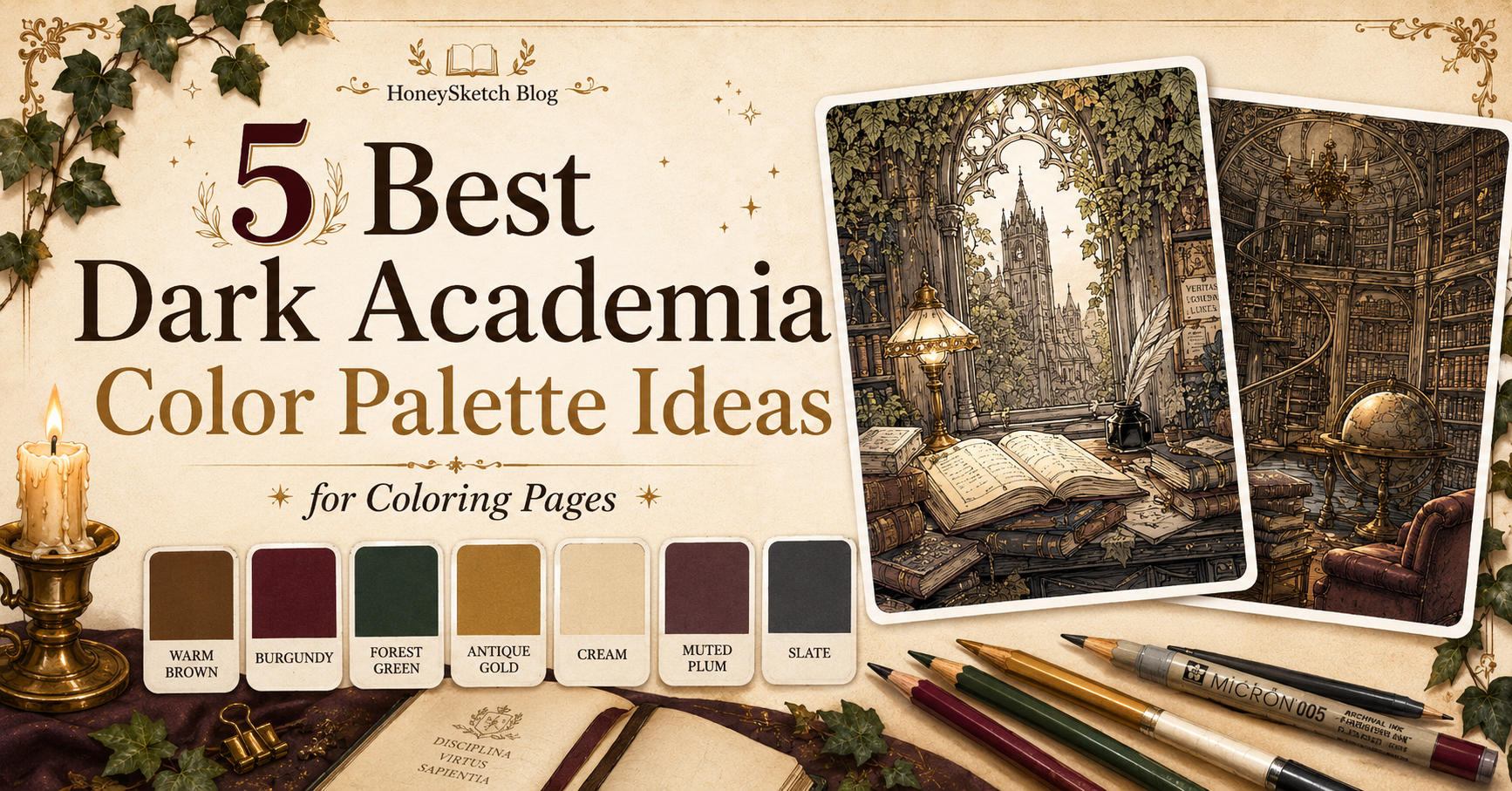
One of the easiest ways to make dark academia coloring pages feel cohesive is to choose a palette before you start. You don’t need dozens of colors. In fact, this aesthetic often looks best when you keep things a little restrained and intentional.

The mood of dark academia usually comes from a mix of:
- warm browns
- burgundy
- forest green
- antique gold
- cream
- muted plum
- soft gray
- charcoal
- dusty blue-gray
These colors work beautifully across the pages in The Dark Academia Coloring Book, especially because the illustrations are detailed without being overwhelming.
A simple dark academia base palette
If you want one easy palette to start with, try this:
- Warm brown for books, wood, furniture, and leather
- Burgundy for fabric, book spines, ribbons, and accents
- Forest green for ivy, plants, and decorative details
- Antique gold for candlelight, frames, metal details, and trim
- Cream for paper, clothing accents, and softness
- Muted plum for gentle depth and mood
This six-color combination already gives you a very strong dark academia feel.
1. Candlelit Reading Scenes
Pages like the woman reading by the window are perfect for soft, atmospheric palettes. You don’t want the colors to feel too bright or modern. Keeping everything slightly muted helps preserve that old-world mood.
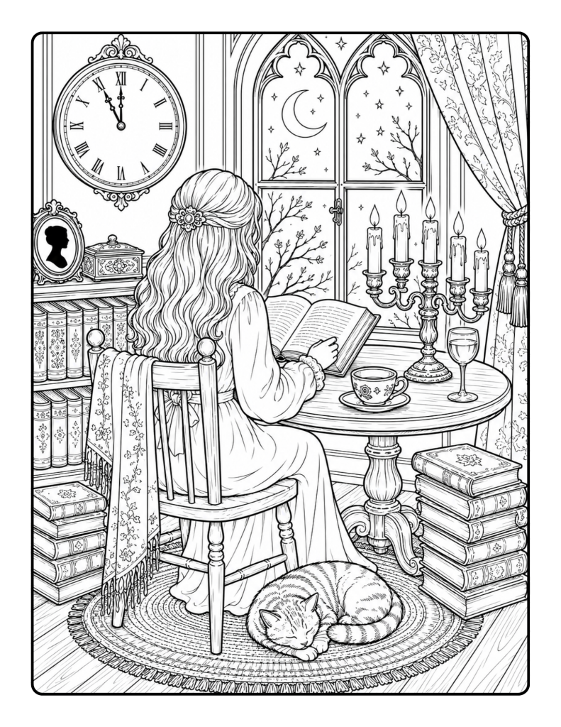
Coloring idea: Use cream and soft beige for clothing, medium walnut for furniture, muted gold for candlelight, and smoky blue-gray for the evening sky.
If you’d like more pages to try these colors on, you can explore the full collection inside The Dark Academia Coloring Book.
2. Rainy Outdoor Gothic Pages
Rainy paths and gothic buildings look best when you let the atmosphere lead. Cool gray stone, soft mossy greens, and only a few warm accents can make a page feel beautifully moody.
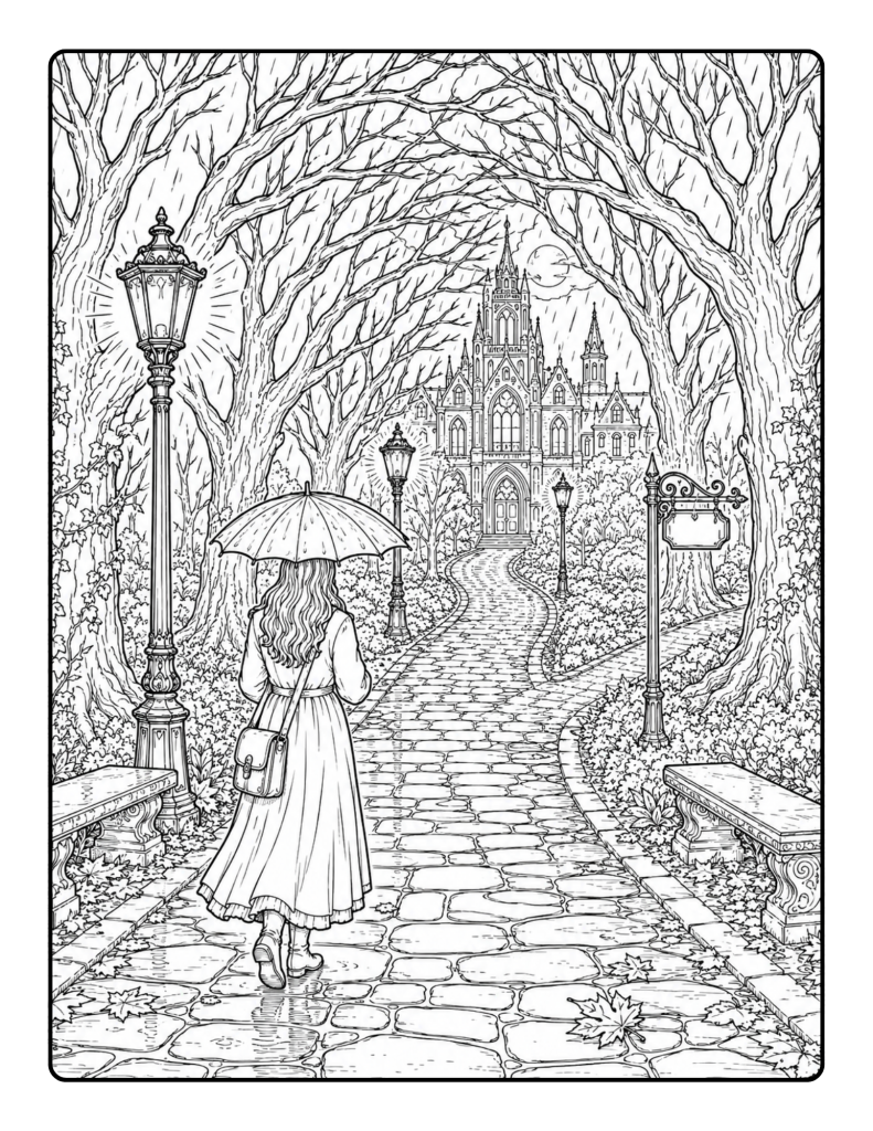
Coloring idea: Use stone gray, charcoal, olive green, and a tiny touch of amber for lamp light or windows.
3. Book-Lover and Library Pages
Pages with book stacks or library interiors can take richer browns and jewel tones without feeling too heavy. These scenes often look beautiful with layered book spines in green, burgundy, deep brown, and black.
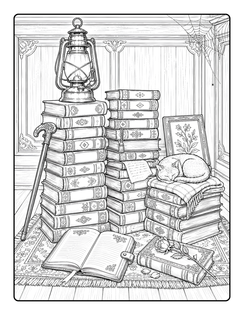
Coloring idea: Keep paper tones creamy rather than bright white, and use brass or gold sparingly for lamps, frames, or decorative flourishes.
4. Gothic Architecture Pages
Detailed architectural pages often look best when the structure stays fairly neutral and the surrounding accents add the mood. That way, the design stays readable and elegant.
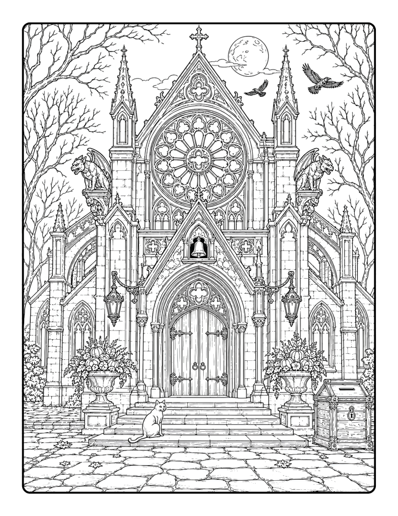
Coloring idea: Try pale gray, taupe, muted green ivy, and a tiny hint of plum or rust for depth.
5. How to keep your pages looking cohesive
A really simple trick is to repeat the same 4–6 colors across multiple pages. That instantly gives your coloring page a more polished look.
You can also decide on a dominant mood:
- Cozy and warm → more browns, cream, gold
- Rainy and mysterious → more gray, charcoal, olive
- Romantic and scholarly → more burgundy, plum, antique gold
Best tools for this kind of book
Because the line art is clean and detailed, these pages work well with:
- colored pencils
- fine-tip markers
- gel pens
- fineliners
If you use markers, place a blank sheet behind the page since the book has single-sided pages designed to help reduce bleed-through.
Who this post is good for
- Beginners who want a starting palette
- Adults who love aesthetic coloring
- Teens who enjoy curated color schemes
- Pinterest users looking for beautiful dark academia inspiration
- Anyone who wants their finished pages to feel more cohesive
Color choice can completely change the feeling of a page, and that’s part of what makes coloring so enjoyable. The same illustration can feel cozy, dramatic, romantic, or mysterious depending on the palette you choose.
Disclosure:
This post may feature HoneySketch books or products. If you purchase one of our books through a link on this page, HoneySketch may earn royalties or income from that sale at no extra cost to you.